Deutsche Bank Research & Design Part 1
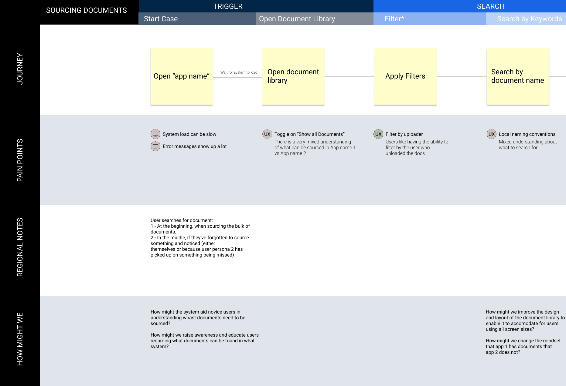
Disclaimer: The Work for this project is protected under NDA, so any visuals shown have been produced for illustrative purposes and are not the actual work produced
Creating the strategy
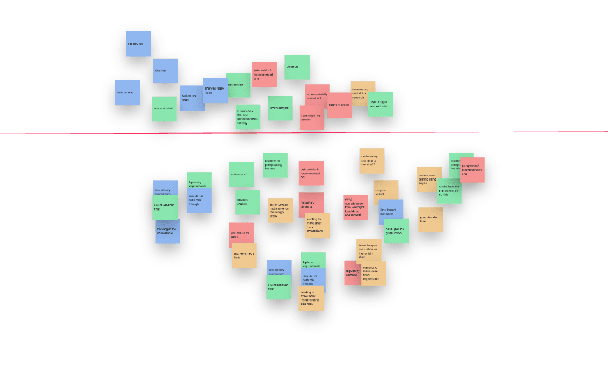
We started with a three hour strategy workshop involving the core UX research team on a collaborative Invision Freehand board. Using affinity maps to cluster our ideas into themes, we agreed on the goals we had, questions we wanted answered, activities we would conduct and logistically, how we would gather insights from 3 user types across 5 different locations.
Defining The Users
Personas already existed for three user types which were developed during earlier UX work on the programme. These personas still acted as vital reference material, particularly at the beginning of our research when we were planning our activities and transferring knowledge to new members of the team. Due to the volume and variety of tasks undertaken by our core personas we used underlying principles, needs and motivations to define our personas.
Stakeholder Interviews
I found that the project brief was, well... brief and did not include a very focused set of problems or goals that our stakeholders were working towards. To add colour to the project brief I conducted interviews with our key business & technical stakeholders to understand their expectations, research goals and the areas of the workflow they would like see prioritised in the research.
Our take from these interviews, was that our stakeholders, whilst clearly passionate about improving the user experience of their application, were too far removed from the users. They did not have a good understanding of the problems with the application beyond a high level and so far had not invested any resources into the large pool of pain points which had been present for close to eighteen months.
These pain-points had pushed many of the users to what became known as "offline workarounds" conducted outside the application, so they could fulfil their role. We agreed that initially our focus of the research would be to understand the key problems, highlight the offline workarounds, and try to piece together any regional differences in process.
Initial interviews
A wide-ranging first phase of interviews was conducted where our core user types were interviewed for 90 minutes each. We observed that in order for one of our users files to be completed, a large number of local policy and regulatory requirements had to be met. The processes undertaken by the user could vary depending on many factors and a self reported estimate suggested it would take two years to experience all of the different process scenarios.
Interviews were recorded in order to analyse & better understand the technical processes the users have to follow. We countered the pitfalls of a remote working environment by making the best of our technology offering and encouraging screen sharing so users could demonstrate the areas of the workflow which were causing the most friction.
We finished off the first round of interviews with a large pool of qualitative data from our interview notes which necessitated new techniques in order to analyse it. Response coding, affinity mapping and pivot tables allowed the team to understand whether user types from different regions had different approaches to the workflow.
Overall we identified nine core research themes from our interviews although there were similar findings within themes:
- Users relied on a large amount of offline workarounds to complete their tasks, often with surprising efficiency gains.
- Excel templates & checklists were crucial for all user types in all region to perform their role
- Recent new features were spoken of in a positive light but unfortunately they hadn't captured all of the users needs which would bring them away from offline workarounds.
Theme Prioritisation
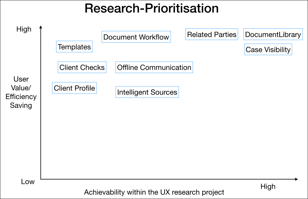
After our first round of interviews and response coded data we were able to go back to our stakeholders with our initial findings, split into nine distinct themes. Further research into all of the themes wouldn't be feasible in the time we had allocated to the project so we decided to use a prioritisation map to help us plot a way forward. We mapped themes against a user value & effort/capacity axis' so it was obvious where the project & eventually users could gain the most from further research and UX involvement.
Thankfully our stakeholders agreed with our top three selections and we proceeded to the next phase of the research...
Building Empathy
With three themes to focus on, and a greater understanding of our users and their role, we crafted task based scenarios for the users to conduct in our second round of interviews. Whilst in the first round of interviews we understood at a high level the problems our users faced, we found that the second round interviews built empathy towards our users when we experienced in detail the technical, procedural and usability issues they faced on a daily basis.
Users relied on spreadsheets to track work where in-app dashboards failed. More spreadsheets and offline checklists were needed, where the application didn't offer the user guidance. Microsoft and Adobe softwares were needed to manage key client document related workflows where in-app features did not have the functionalities to perform tasks effectively.
Whilst there was a feeling that some of our users had "tunnel vision" and refused to veer away from their established ways of working or adapt to new in-app features, we also felt that a strong case could be made to say that working outside of the app to for example, annotating client documentation could sometimes reward the users by speeding up their workflow, where the app was failing to live up to demand.
We also investigated the workflows inside the previous incarnation of the application as some users had displayed a preference to some of its features. Our comparative task based scenarios allowed us to compare steps taken and time to complete certain tasks which also helped us uncover additional user needs.
Heuristic Analysis
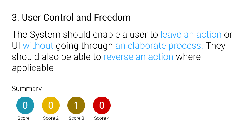
An application wide analysis was conducted against Nielsen & Molichs ten heurstics to measure the usability of the application. We ranked the identified issues on a scale ranging from cosmetic to usability catastrophes. The consistency and standards heurstic was referenced the most, with similar functioning components across different areas of the app, operating in stark ways. This heightened our suspicion that some of the problems with the application were driven by the siloed nature of some of the development teams on the project.
User Journeys
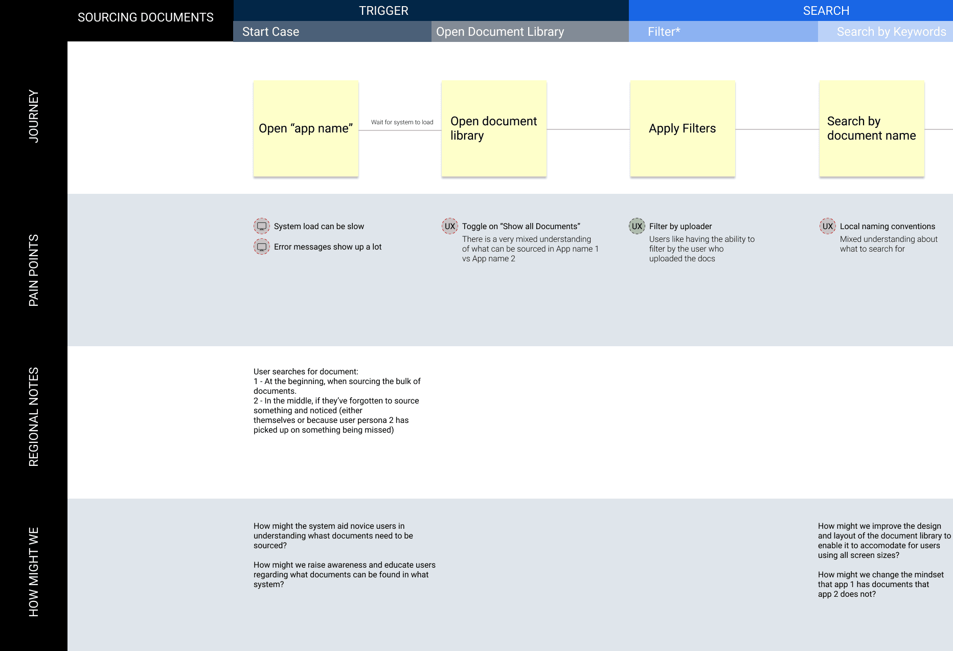
We were able to analyse the data from our second round interviews, and better understand the task based scenarios we had observed by mapping user journeys. Within the journeys we called out pain points, timings, regional variances and we also included a 'How might we' lane next to identified pain-points to try and facilitate a problem solving/creative mindset within the team.
Survey
A survey was distributed to gather data from our large pool of users across the globe. Questions focused on the themes we had highlighted in the interviews and helped us gather more quantitative, albeit, self-reported data. Offline processes were such an important theme in our work and amongst many things, the survey allowed us to understand the features or data that are needed to bring more users into the platform and away from spreadsheets and emails.
Final Report
Our final report included findings from 37 interviews and nearly 300 survey responses. We split the report into 3 with each section reporting on a prioritised theme. We reported a finding within a theme with a simple and consistent structure of; what we saw, why we saw it, what impact does the finding have and our recommendations. The recommendations varied from quick wins, to those that would require a strategic effort to tackle.
At a high level our report detailed the following:
- One particular workflow within the application was causing an untold amount of issues. We made several UX/UI recommendations but with such a vast amount of usability, IT performance and process related issues, a complete reform of this workflow was our overall recommendation
- A combination of a lack of in-app guidance and functionalities to efficiently manage client documentation meant users had the inability to work with documents and their annotations without offline processing.
- A fundamental need was identified to bring enhanced document features into the app whilst allowing the user to work with client documents side by side to the client questions they are required to answer in a single screen.
- Offline processes were highlighted again when we discussed the lack of options for all user types to manage their workloads and understand the context behind their cases
We spoke about the limitations of some of our findings in the absence of an analytics tool as some of the findings were self reported and inherently biased. The availability of a more fine-grained analytics tool was one of our general recommendations.
With over 30 recommendations in the final report and more highlighted in the heuristic review there was a lot to take away from our research. The good news was that our programme leads were receptive to our ideas and we were able to kick off with some of the UX work straight away. Every finding from the heuristic review was put into the development teams' backlog and our project decided to hire additional UX staff to help tackle the larger scale pain points.