Deutsche Bank Research & Design Part 2
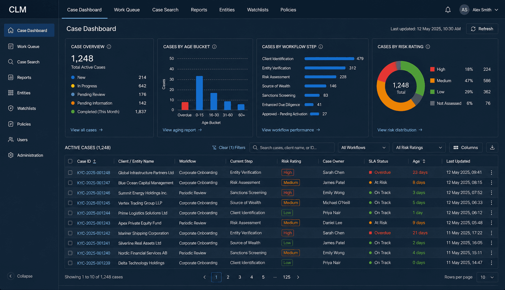
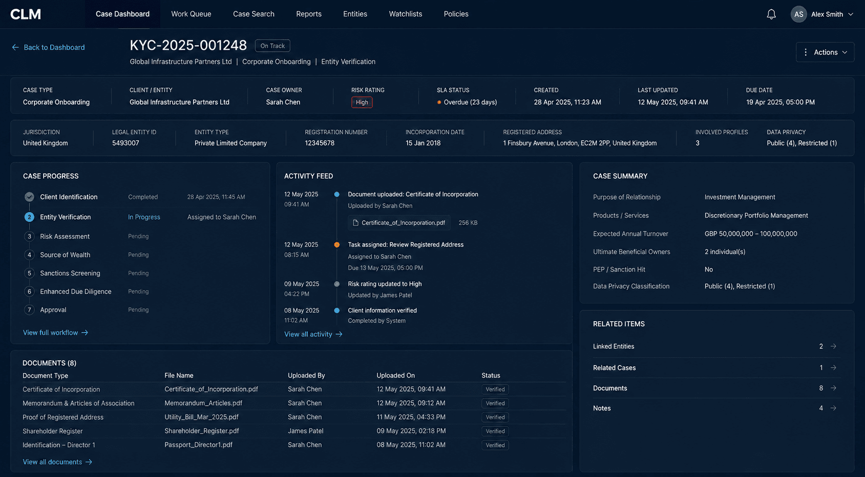
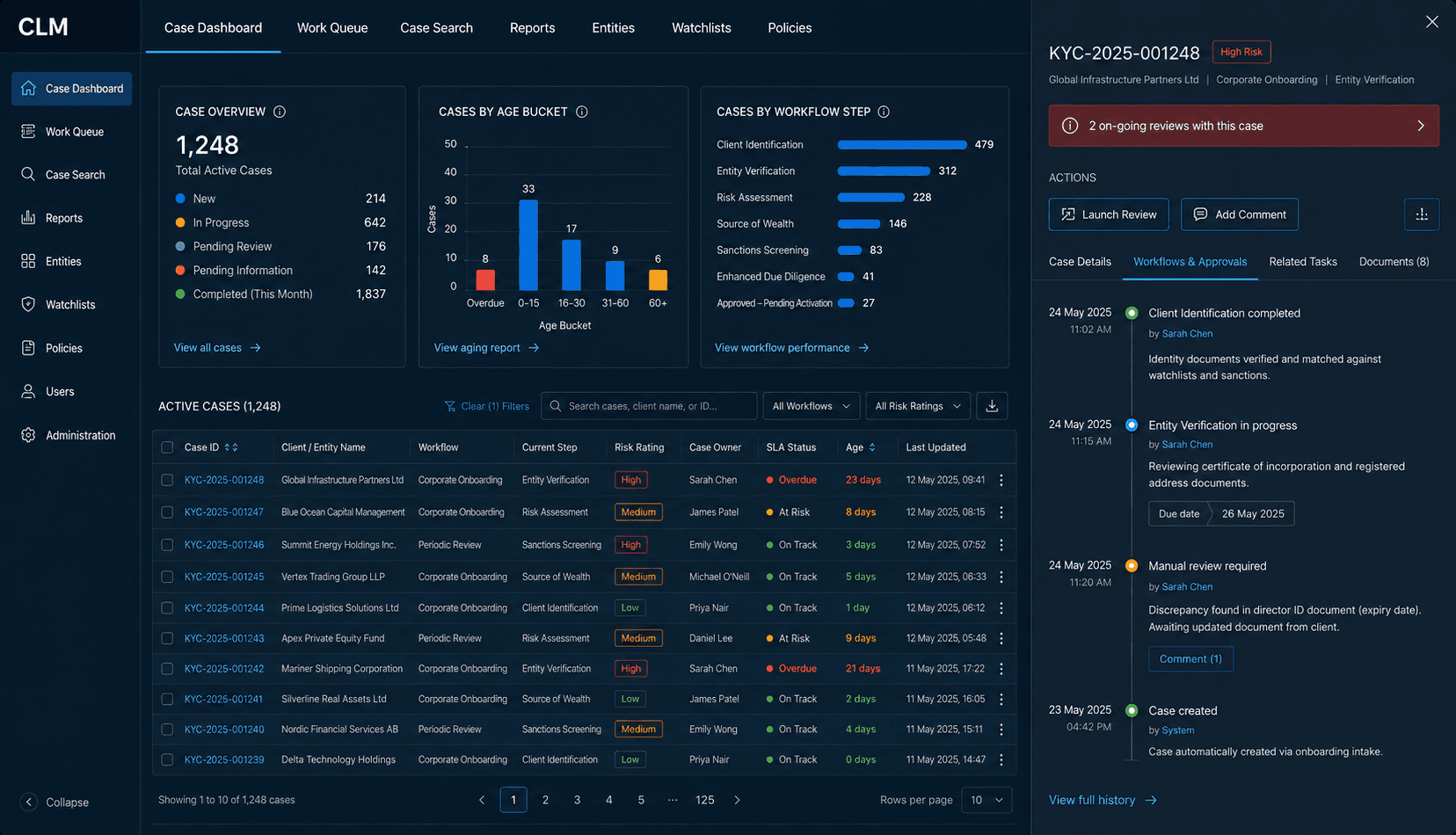
Disclaimer: The Work for this project is protected under NDA, so any visuals shown have been produced for illustrative purposes and are not the actual work produced
Unpacking The Findings
We begun by analysing the large pool of data we accumulated from our user interviews and survey responses and were able to highlight the key user needs to improve case visibility:
- Cases needed to sit within a single dashboard. At present the users had the information required available, but this would sit across twelve different dashboards. This had led teams to create spreadsheets so that their understanding of work to be done could be monitored in a centralised place. A self reported statistic from our survey found that users claimed to spend around 4 hours a week maintaining offline spreadsheets
- The information presented to the user in the single dashboard needed to be tailored to different user types
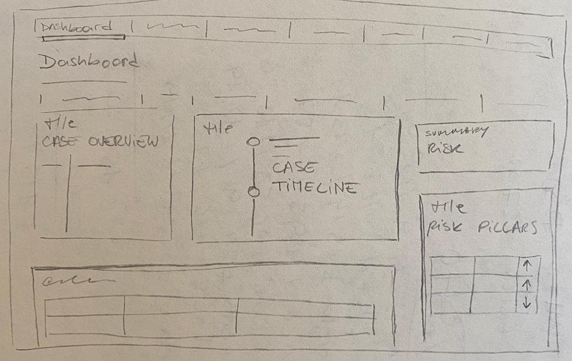
- Currently there were no summary dashboard pages once a case is opened to understand the context of a case, as well as what is required to bring the case to completion. Therefore a Case Dashboard was identified as a key requirement in this delivery.
Single Dashboard Information Architecture
To create a single dashboard from twelve individual apps required in-depth knowledge of the key functionalities of each app. Whilst some dashboards presented static information about cases which then could be opened and worked on, others allowed the users to conduct workflows within them. I spent around a week in demos from the app owners of the twelve respective dashboards as well as digging into their training material in order to have a full understanding of the information and the executable workflows.
Content Audit
From here I was able to conduct a content audit by mapping the current dashboard architecture into a sitemap and verifying it with application owners.
Reviewing the content audit with a business analyst allowed us to understand that nearly all of the information & functionalities contained within the sitemaps would need to be considered as requirements in our single dashboard.
A deep dive into the research data led to additional requirements, particularly dynamic data the users needed to see centralised, but we also found some additional functional needs.

Single Dashboard Sitemaps
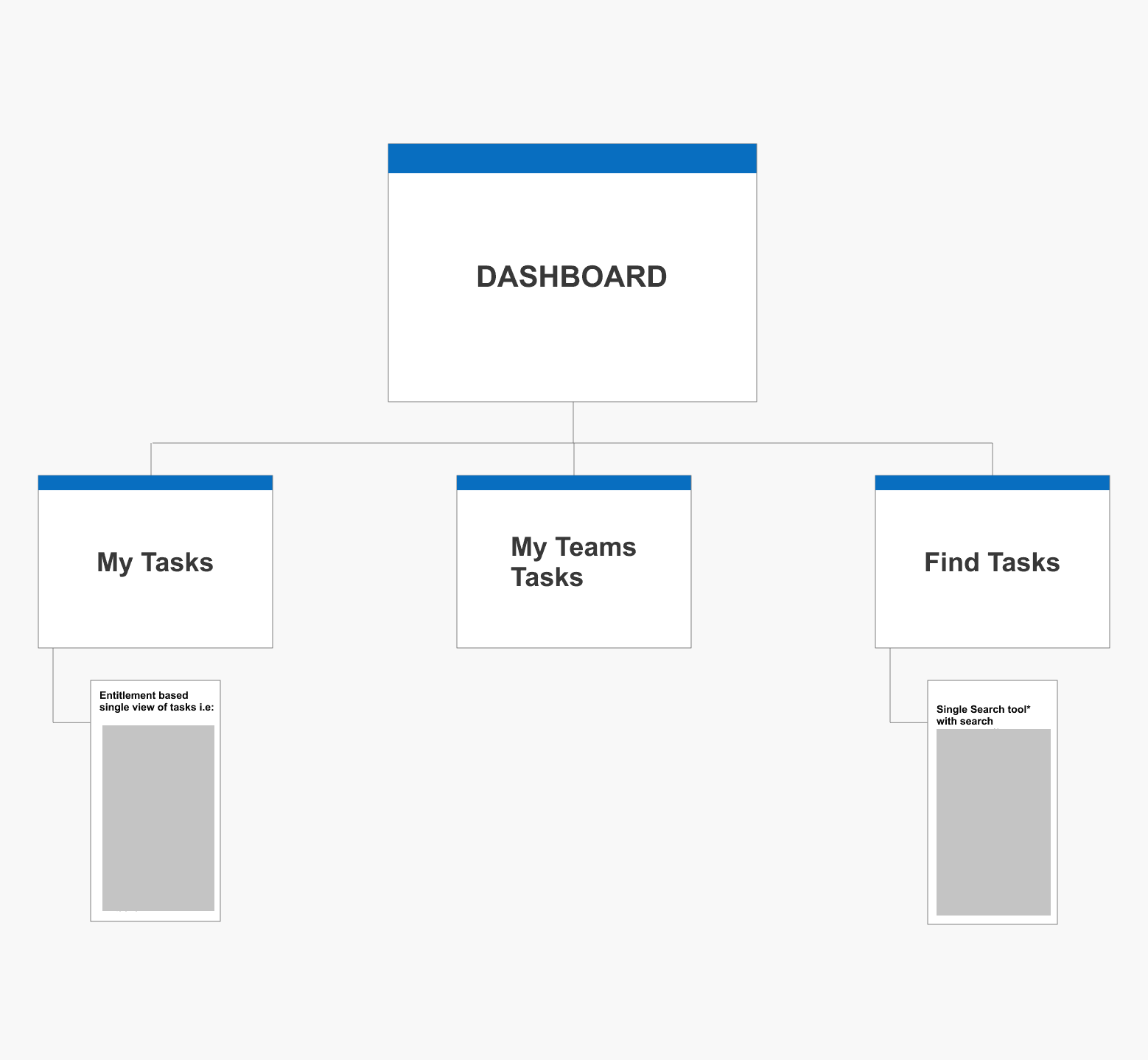
Using the content audit, our research findings and knowledge of the user personas allowed us to propose future state single dashboard sitemaps for our 3 main user types. I went back to our users to validate these proposals with card sorting exercises, again using Invision Freehand.
Some detail redacted:
Workshop For Case Dashboard
Whilst the research data gave us some baseline user needs for a single dashboard we didnt feel we had quite enough to propose our case level dashboards which we hoped would provide the user with further context on their cases when they are first opened.
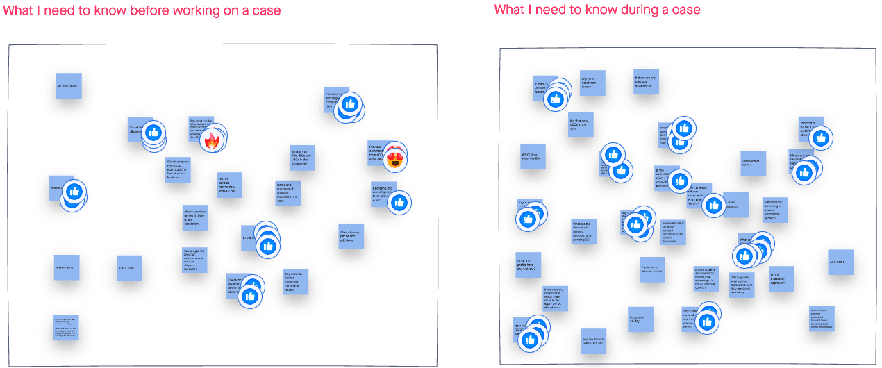
I organised and facilitated workshops with two of our core user personas to understand additional user needs. We used invision Freehand to allow our participants to state their needs for two scenarios where we identified that case context is valued the most. The first was 'what do I need to know when beginning a case' and the second was 'what do I need to know during a case.'
The workshops were very collaborative and included product owners and SMEs. All ideas noted were discussed to ensure there was a common understanding which segued nicely into the dot voting which we held at the end of each activity to bring forward the most popular ideas.
Deciding the structure
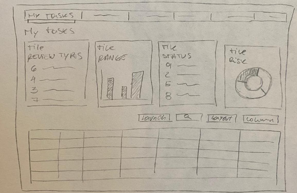
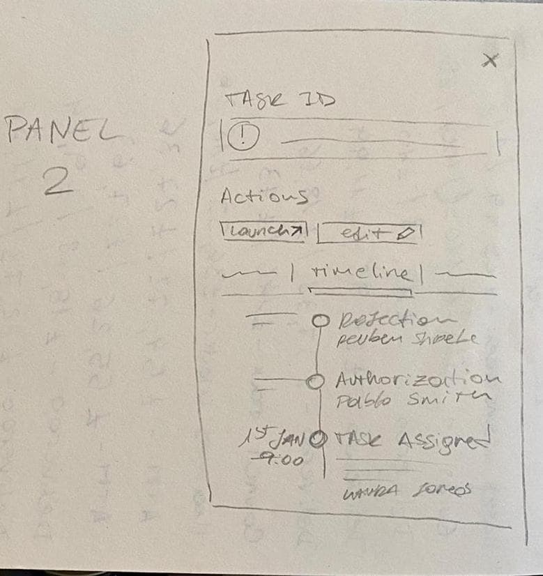
With our sitemaps and user needs in mind, we were able to start sketching ideas for our single and case level dashboards before transitioning into wireframes. These could be tested with ease and adjustments could be made in little time before we moved to mockups.
User Testing
User tests revealed some small weaknesses in the design in some of the interactions and highlighted additional location-specific requirements. Most of our users came to these sessions armed with smart questions and they informed improved iterations.
Mockups
Recreated for illustrative purposes