Self-serve solutions for card & payment issues
Disclaimer: The Work for this project is protected under NDA, so any visuals shown have been produced for illustrative purposes and are not the actual work produced
The Problem
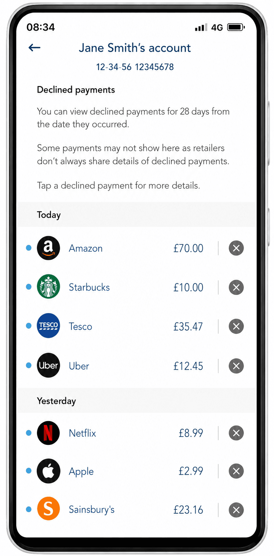
The project addressed a critical gap in the clients in-app experience - users lacked the ability to self-serve card or payment issues digitally. The clients app didn’t indicate when a payment was declined or when a card is blocked, leaving customers unaware of problems which were impacting their everyday spending. Consequently this was a driver of inbound calls into telephony teams and this increased the time where customers are unable to use their account.
The Challenge
A key initial challenge was addressing how we could minimize spend interruptions by helping customers quickly identify declined payments, and providing simple solutions for over 30 unique scenarios.
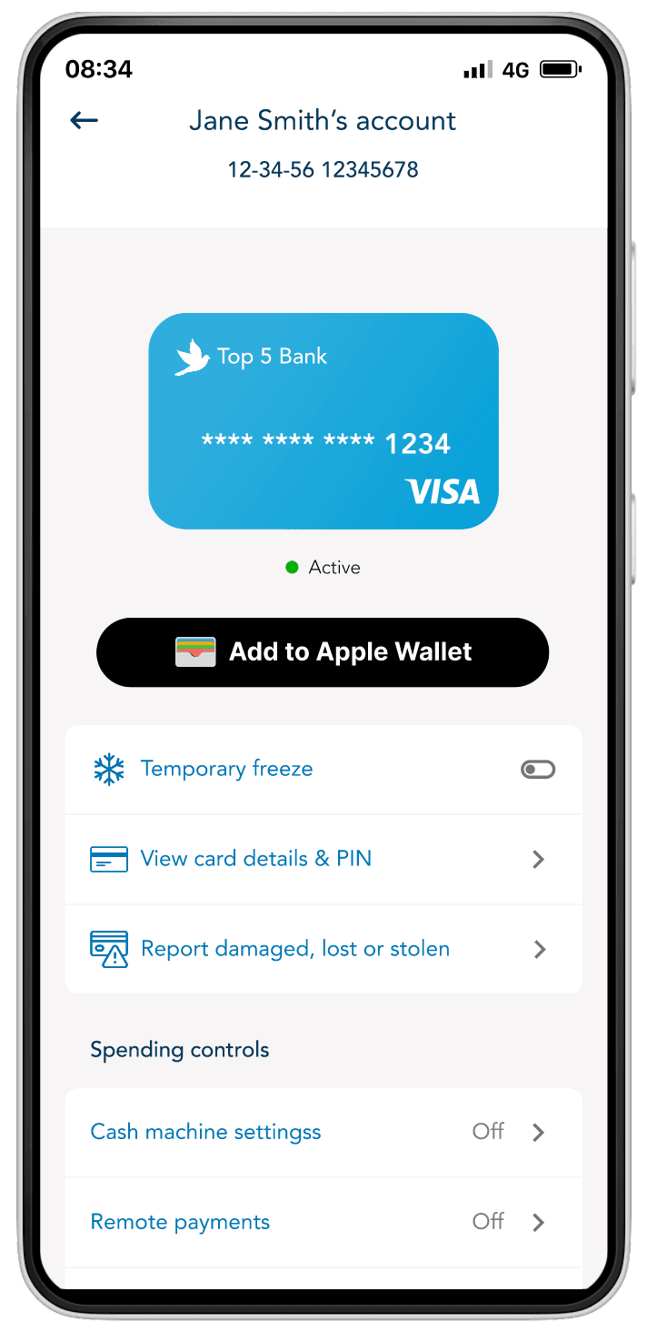
When it came to blocked cards our challenge was again around signalling card problems to customers in a simple, consistent manner especially when cards or accounts were partially or fully blocked. It was important for customers to understand the nuances of card statuses, especially when their understanding could help resolve issues or, in cases of partially blocked cards, allow them to manage resolutions while maintaining spending capabilities.
Across these journeys—whether involving card or payment issues—we aimed to incorporate educational content into the experience, helping customers prevent similar issues in the future
Alignment workshops
We hosted an alignment workshop to bring key stakeholders together and establish a shared understanding of the current "as-is" journey for declined payments. The session involved an in-depth review of customer research, call recordings, voice data, and complaint analysis.The findings revealed a consistent issue: customers were often left confused about why their card was blocked or payments were declined.
The root cause was clear—there was no visible trace of card or payment issues across digital channels. In the mobile app, debit cards appeared active, and transaction histories showed no indication of declined payments.
As a result, customers had no alternative but to contact telephony teams or visit branches for support and resolution.
Using a simple "How might we" exercise, we identified key opportunities to address these pain points, emphasizing the need for issue visibility and self-service solutions. These insights align closely with the bank's broader strategy to digitize everyday financial journeys and reduce reliance on branch and telephony support.
Design
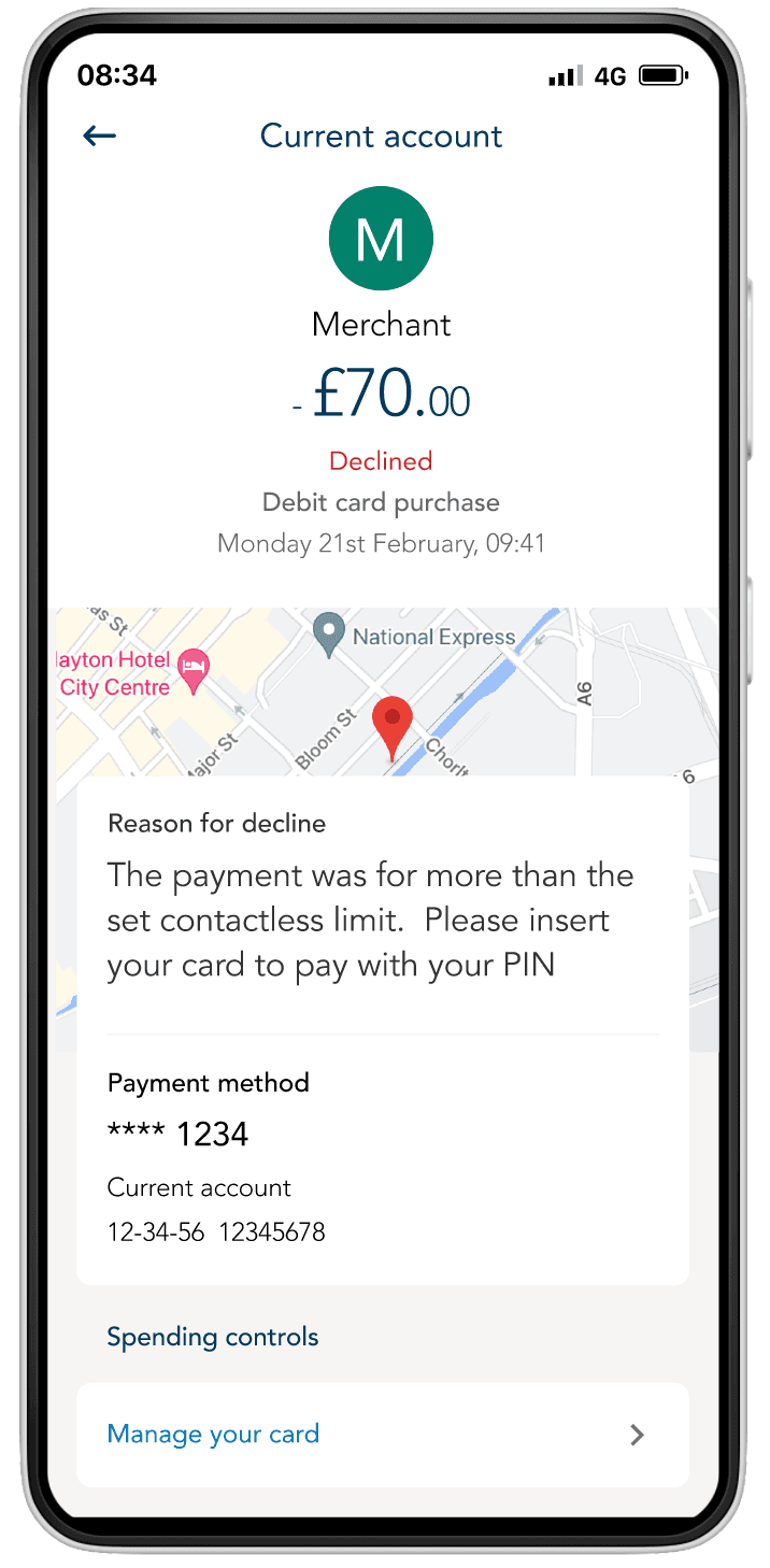
A key challenge in the design phase was creating a scalable structure and framework that could accommodate over 30 unique declined payment reasons and seven different card-blocked statuses. Each screen needed to present information in a clear and concise way, ensuring customers could quickly understand the reason for the decline. This included displaying:
- A simple explanation of why the decline occurred.
- The location of the transaction attempt to provide context.
- Merchant information to aid recognition.
- A prominent call to action to enable quick and effective remediation.
To ensure customers were directed to the appropriate screen, we incorporated a push notification that would deeplink them directly to the declined payment details. The notification copy, crafted in collaboration with our copywriter, was carefully designed to encourage customers to tap and view more details, balancing urgency and reassurance.
We also included an informational box to educate customers on how to prevent similar declines in the future or to guide them through multiple remediation options when applicable.
Research
Usability testing showed that customers found these screens easy to navigate and understand, but there was an opportunity to enhance the remediation experience. Specifically, we identified the potential for a 'single-tap' remediation.
For example, if a decline occurred because contactless payments were switched off, the call-to-action could directly enable contactless payments with one tap, rather than directing customers to the card controls section of the app.
Beyond this, much of the refinement involved tweaking the copy across the journeys. The focus was on ensuring that customers felt confident to take action themselves, rather than feeling the need to call the bank out of fear or anxiety—especially in cases involving blocked cards.
Workshops
We held workshops with key stakeholders, including our technical teams and the solutions architect, to determine how to use the project funding effectively across several releases over a 12-month period. The focus was on breaking the work into manageable phases to deliver customer benefits quickly, rather than committing to a lengthy multi-year build process. These discussions also highlighted dependencies on parallel releases that could help streamline or unlock a smoother delivery for our team. Based on this, we made the decision to deprioritise the 'single-tap' call-to-action idea mentioned earlier for the phase 1 release, focusing instead on delivering core functionality that addressed the most pressing customer needs first.
Selected Mockups